Back Story
I went to dinner with my family at the resort. The atmosphere was cozy and inviting, and I couldn’t wait to try the delicious-sounding dishes on the menu.
However, as I looked over the bill after my meal, something caught my eye. The resort website address was listed on the bill.
Upon visiting the website address, the site was not in working condition, I checked it with my phone and while back at home was having the same issue, As I dug deeper, the site certificate was expired, It was not a great experience to see that furthermore, the domain was also about to expire, I saw an opportunity here and thought to build the site with my expertise.

To access the site I enabled it through the advanced tab, This is how the site appeared (attached Image below). My initial thought was should I build this ?? building this should not be a waste of my time, maybe the client won’t want to continue with the website. With all the various thoughts I just went ahead to build it, maybe I can use a concept project and create a case study or blog out of it.
The creative person within me wanted to create a case study like Growth.Desing but after spending some time realized that I was making it more complicated, better to publish something rather than nothing.
Case Study
After studying the resort website here is my list of points where the site needs improvements and changes.
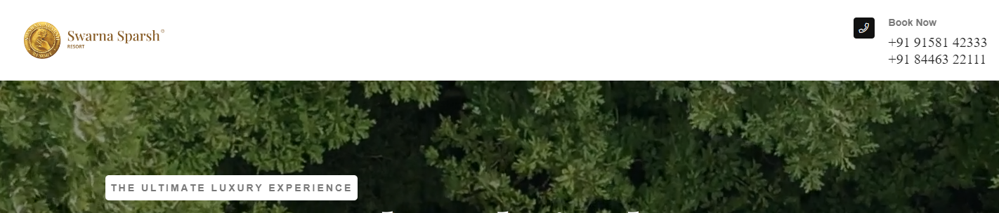


- Sticky Header with No Navigation menu, just phone numbers with no proper alignments.
- Since No navigation, the user cannot navigate to the reservation page.
- With just great-looking property but not a single image of it on the website.
- Fonts are not consistent across the site.
- Throughout the site, there are no left-right alignments.
- 2 different footers and both footers were distinct from each other.
- The site was not mobile-responsive.
Conclusion
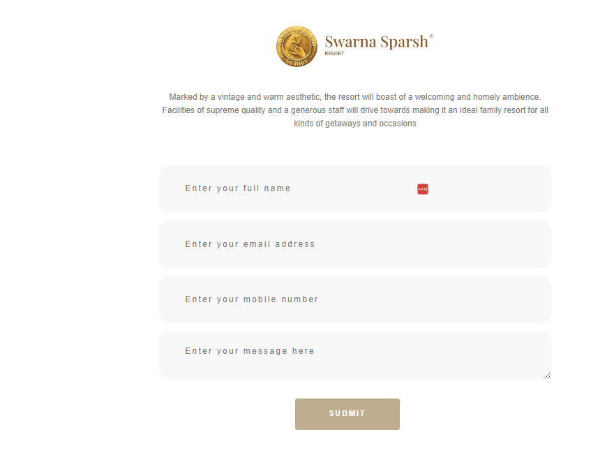
After spending over a week on it. The new updated version of the resort website.
- Fully Mobile Responsive, Since many user access the site through mobiles.
- Added property Images, a few as banners, and a few in the about us section.
- Made it a single-page site with proper navigation.
- Added Map for users to navigate while they land on the website.
- With proper left-right alignments across the site.
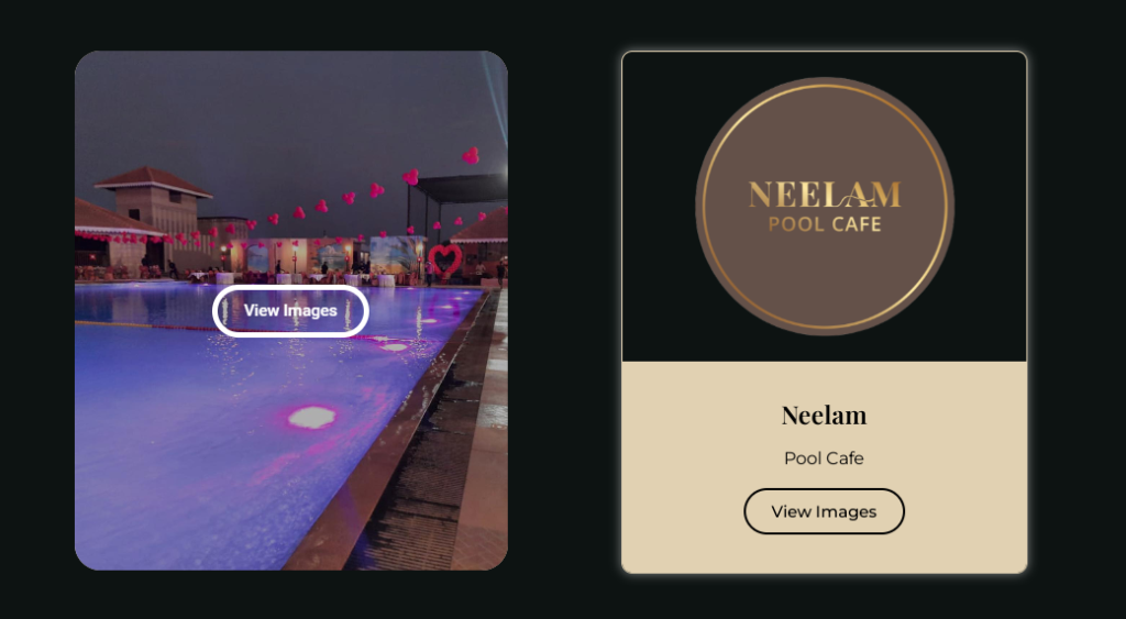
For services, I tried various methods and finally went with the button card, The name of services and their icons are very unique for the resort so I did not change them, The flip effects from the right or other animation were considered but having more clicks to see what’s inside service is what makes it complicated. On mobile devices, the hover effect appears when you click on it. so this made my decision to go with the button card.

This is how I finished the project, the color scheme and heading fonts are inspired by the logo and the secondary font is Montserrat.
The property images and their ownership belongs to the resort solely, I took these images from Instagram and used them for the project specifically.
This case study does not aim to criticize the other developer or agency, Intention here was to highlight the missing points and Improvise the website from a business perspective.
If you have any suggestions or feedback please send me a dm over Twitter.