As a web developer, I often visit other creative professionals’ Twitter profiles and websites to study their work and gather inspiration. In order to sell my services, I conduct in-depth studies of these websites and come up with my own versions that address any flaws or areas for improvement.
This helps me to showcase my skills and demonstrate my capabilities to potential clients. By doing this, I am able to provide proof of my work and show that I am capable of creating high-quality websites that meet the needs of my clients.
In this post, we’ll walk through a case study where we analyzed a portfolio website and made recommendations for improving the user experience. Website Link
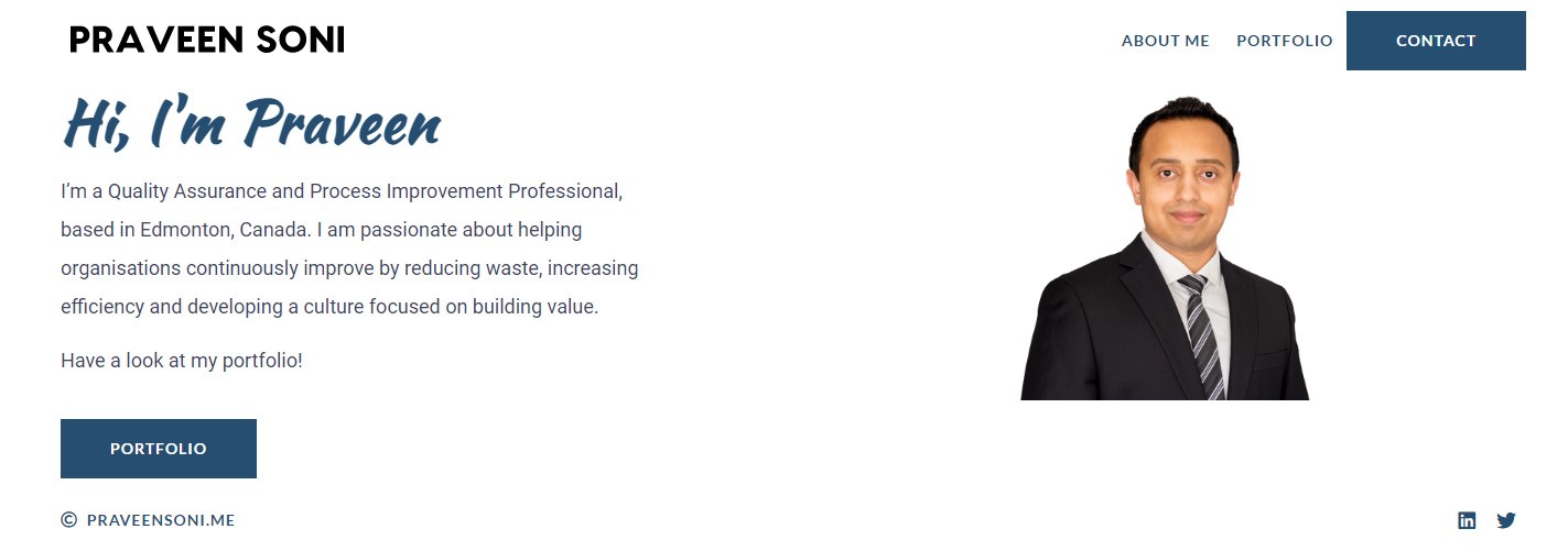
The website contained multiple pages with information about the user’s work and background. However, during user testing, I found that the multi-page layout made it difficult for users to quickly find the information they were looking for as each page section contains information about one-fold.
To address these issues, we made the following changes to the website:
- We redesigned the site as a one-page layout, with all the information organized into easy-to-scroll sections. This allowed users to access all the content in a more cohesive and intuitive way, without the need to click through multiple pages.
- Showing Feature case studies or blogs and adding a ‘Know More’ button where website visitors can see other details and posts.
- On visiting the about us page there was a CTA of download a resume. Since it’s important it can’t be inside the page we can just lock up it with the portfolio button in the hero section. by doing this we have both important buttons right up there when the user visits.
- Instead of the contact us form as a popup, a section on the page is better in context to this website, and more accessible to users who have disabilities or use assistive technologies, as it may be easier to navigate and interact with on the page.
Website Changes

Attaching the original website link, all data and images belong to praveen.me, the above images have been used for case study purposes.