Elementor does a terrific job and provides ease of making the site responsive.
But not all the time does it help us and this is where the knowledge of CSS is helpful. Writing custom code while using elememtor provides you more power to customize the things as per the design.
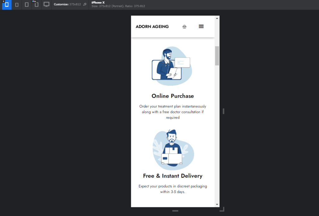
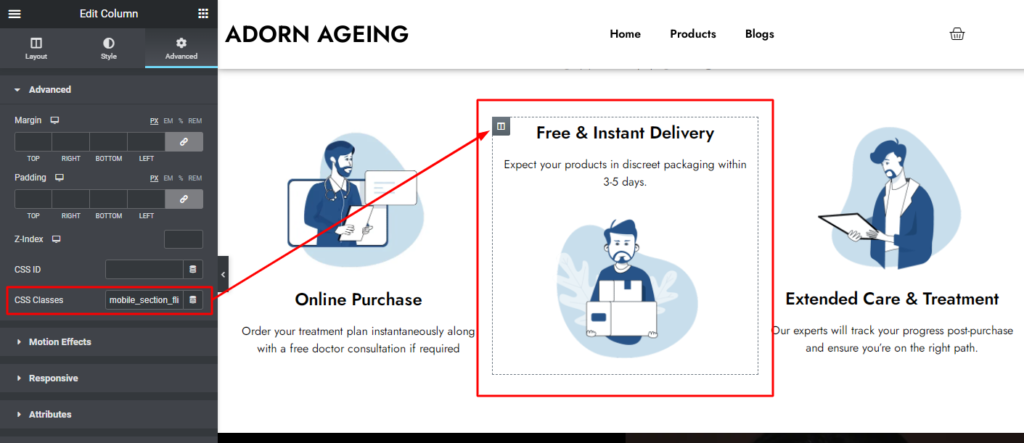
The Problem Statement: In responsive mode, the order of columns should be the same, The 1st column follows Image first then heading and paragraph, the same we need for the second column as highlighted in the below image.

The solution we need to achieve is shown in the below image. This can be done without coding which requires more columns and duplications, which ultimately effects speed of the site, We need to have optimized site so we can achieve good speed.

Lets have the close look how this can be achieved, In Image we can see there are three columns we need to target the middle one ( by clicking on book icon). Go to advanced section CSS classes and add the custom class and update the page. Now we need to make the whole box as flex (“display : flex”) and give order to each items under the columns i.e Heading, paragraph and image.

By making it display flex, we got the property of ordering the elements and through that we can shift the items, By targeting image and setting it’s order to -1 makes image display above the title and targeting heading and setting it’s order : 0 make’s no change ( which comes below the image ) and lastly targeting paragraph order to 1 make it display last.
This is how easily we can achieve this design in mobile view with no additional plugin.
/*-Media Query Targeted for Mobile view  */

@media only screen and (max-width: 768px) {

    .mobile_section_flip {
   	   display : flex;
	}

   .elementor-element.elementor-element-0b5584c.elementor-widget.elementor-widget-image {
    	order : -1;
	}

   .elementor-element.elementor-element-fa20a0f.elementor-widget.elementor-widget-heading {
   		order : 0;
	}

  .elementor-element.elementor-element-064d1eb.elementor-widget.elementor-widget-text-editor {
   		order : 1;
	}

}
