When receiving a draft of content from the client, The very first thing that the mind runs is putting that content in the various UI components. It’s not as simple as it sounds to put the content in the components.
The process goes from which component to select, why we should select that component, and how it will best represent the information to the users. No matter what you do “Why” and “How” tools should be kept handy and used often to back your decision.
There are various UI components but here we will particularly study Sliders and Tabs.
Sliders
Sliders, the versatile component, find their place in various corners of the digital landscape. From eye-catching banner sliders to the ever-popular post loops (commonly known as carousels), sliders serve a multitude of purposes.
Banner Sliders: When you want to grab your visitors’ attention and showcase multiple images or messages in a space-efficient manner, banner sliders are your go-to choice. They create an engaging visual experience and allow you to convey a range of information or promotions without cluttering your homepage.
Price Range Bars: E-commerce websites often employ sliders to make the shopping experience more interactive. With a price range slider, users can effortlessly set their budget, creating a seamless and personalized product browsing experience.
Map Distance Selection: In maps and location-based applications, sliders help users fine-tune their preferences. Whether it’s selecting a radius for nearby restaurants or adjusting the zoom level, sliders simplify the process of interacting with maps.
The Art of Choosing
- Content Relevance: Ensure that slider content aligns with your website’s goals and presents related or complementary elements effectively.
- User Experience: Prioritize an intuitive and distraction-free user experience with clear navigation controls.
- Mobile Responsiveness: Optimize sliders to function seamlessly on various devices, including mobile phones and desktops.
- Performance Optimization: Minimize page load times by optimizing slider images and scripts for a smoother user experience.
- A/B Testing: Use data-driven A/B testing to assess the slider’s effectiveness compared to alternative design elements on your website.
Points to Keep in Mind
- Page Speed Impact: Sliders, especially banner sliders with multiple high-resolution images, can significantly impact page load times. Optimize images and scripts to maintain a fast and responsive website.
- Uncertain User Interaction: Metrics often struggle to provide clear insights into user interactions with sliders. It’s challenging to determine whether users engage with all slides or simply ignore them.
- Purposeful Animation: If you choose to use animations within your slider, make sure they serve a purpose. Avoid flashy or distracting transitions that can annoy or confuse users.
Tabs
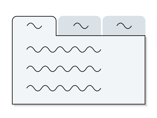
Tabs are the unsung heroes of web design, simplifying content navigation and ensuring users find what they need without getting lost in a sea of information.

When to Choose Tabs:
- Organizing Content: Tabs are ideal for categorizing and organizing content into easily digestible sections, making it effortless for users to explore different aspects of your website.
- Clear Navigation: Use tabs as primary navigation menus to help users navigate your site seamlessly, ensuring that they can swiftly access the information they’re seeking.
- Multi-Step Processes: When breaking down complex tasks into manageable steps, such as forms or checkout processes, tabs can guide users through the journey one step at a time, reducing cognitive overload.
- Comprehensive Product Information: Tabs provide an excellent way to present in-depth product details, from specifications and reviews to FAQs, ensuring users have access to all the information they need in an organized format.
- Interactive Storytelling: Tabs can be used to tell interactive stories, where each tab represents a different part of the narrative, creating an engaging and progressive reading experience.
Points to Keep in Mind:
- Content Balance: While tabs control page length effectively, be cautious not to hide critical content. Poor execution can lead to issues, regardless of SEO or content quality.
- Comparison Limitation: Avoid using tabs for direct content comparison. Frequent toggling between tabs can strain users’ short-term memory, increase cognitive load, and raise interaction costs.
- Visual Feedback: Ensure that your tab design highlights the currently selected tab. This visual feedback helps users stay oriented and understand which section of content they are viewing.
